
Learning to read a stock chart, at the outset, is a special form of hell.
It looks like a mix of arithmetic, number theory (maybe, I’m not entirely sure what that entails (Editor’s Note: my father studied number theory – also have no clue)) and analytic geometry. And no, I did not know that last term, I had to google ‘math that uses graph’.
Aside
They should really put a trigger warning on such things. You know, for all of the artistically
inclined kids in school that suffered mental breakdowns over pre-calculus. Especially given the fact that it has proven to be thoroughly useless in adult life. What an honestly sick joke to play on hormonal teenagers.
Now, remember using a parabola graph calculator – the clunky one with the sin, cos, tan nonsense? Well, sorry if you’ve been triggered, but I can assure you that this is nothing like that. In fact, I don’t think a mental breakdown is on the horizon for any of my right-brained readers: that is, if I can grasp it, you certainly can…
You’re wondering if you want to invest in a company. You firstly, as I have just done with ‘math that uses graph’, google it. I am going to use Apple as an example because, well, we all have phones and they always break, and we always buy new ones, and whatever the hell the “cloud” refers to seems to always be full and I am always buying more “room” for it.
So, seems profitable. You type the ticker symbol AAPL into the search box.
A graph will appear that looks like this:
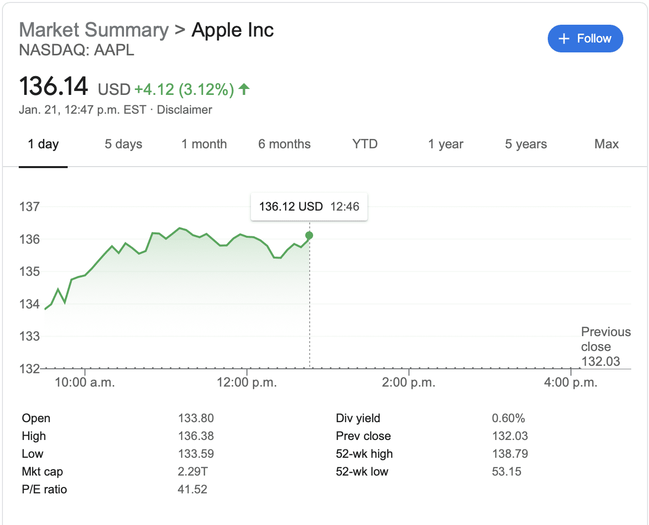
Top gibberish: At the very top, it will list the market the company primarily trades on.
For Apple, that is the NASDAQ.
Right underneath, it says 136.14 USD. This number marks the price of the last trade they have on the stock. In this case, at this second, someone had previously bought Apple stock for $136.14 US per share. If you do any googling of your own, you’ll see that this number changes frequently. This is because thousands of trades are happening per minute, so think of this as a sort of blended view – a real-time ticker would trigger a seizure in anyone with epilepsy.
The +4.12 means that the stock is up (worth more) than yesterday.
So, Apple stock this Thursday afternoon is $4.12 US more “today” than it was yesterday.
The 3.12% is simply a percentage version of the aforementioned change in value.
The Graph itself: The price per share is listed on the vertical axis and the time, on the horizontal. This can be altered by changing the length of time at the top of the graph if you want a more comprehensive view of what’s what. It is no different than the terrible Covid cases charts you see everywhere. Or the terrible x-y axis you used to see on the parabola graph calculator.
~ then, you’ll see 9 cute little terms below the graph ~
Open: This number marks the price of the stock when the market opens (at 9:30 AM EST).
Fun fact you probably don’t need to know: since 1985, the New York Stock Exchange rings what’s called the opening bell (this is a literal bell) to start off the day’s trading session – as if it is a horse race or anything more exciting than money being cyclically shifted about by predominantly sweaty men in suits (or well, machines, now – operated by the sweaty men).
High: Simple. The highest price at which the stock was traded during a period.
Low: Read above – flip it, reverse it, whatever else Missy Elliott says.
Mkt Cap: Market capitalization (these abbreviations are so lazy) is the market value (the value that the investment community gives to a particular equity or business) of a company represented in a dollar amount. It is simple math (and that’s coming from me – so think elementary school level): you take the number of outstanding shares multiplied by the current market price. In our case, Apple has 16.823 billion shares outstanding, at today’s $136.14 price per share, and you get, apparently, $2.29 trillion.
P/E ratio: This one is important, so as it goes, is slightly more complex. Again with the abbreviations, the price-to-earnings ratio is basically a snapshot of the earnings of a company compared to the share price they are trading at. So, in our case again, Apple is trading at 41.52 x its earnings per share.
As an equation: P/E Ratio = market value per share/earnings per share.
Think that a drug company has found a cure for cancer. The trials are extremely promising, but the drug isn’t yet being distributed. The stock price, because people would be pretty stoked about such a discovery, would go up. The stock could be trading at 90 x its actual earnings (since there aren’t yet any earnings). As I explained moons ago, the stock market is an attempt to predict the future. The higher the P/E ratio, the higher the valuation of a stock and potentially the riskier it becomes. With this, tech companies and those of innovation will typically hold higher P/E ratios because, as with a promising cancer cure, people are excited about the new thing to come. There is no roof on what it could be.
It’s pretty standard for companies to be trading at a P/E ratio higher than what we might expect (that is, 1). As we’ve said before, the stock market trades on what you the investor believes the company to be worth – to yourself and to others. Since everyone wants to believe the best in the company, that pushes the P/E ratio higher.
(FYI – to know whether that P/E ratio is reasonable, you really want to compare it to the P/E ratio in that industry)
Div yield: Think of a dividend as a little money gift a company gives their investors out of their profits every x time frame (the company decides). They say, ‘thanks for owning our shares and because we have all this money, we’ll give you a little bit back, so you know we have so much money we don’t even use, so you should stick with us’. Dividends are usually higher on shares of industries that aren’t volatile, to compensate for the lower cap on profit.
For example, BC Hydro probably isn’t coming out with the next hot thing. No one is on their toes dreaming of what brilliant product BC Hydro will come up with. I don’t think anyone ever thinks about BC Hydro aside from the monthly eye roll it elicits when the bill comes around. So, to make it an attractive investment, and because they are steady (a Taurus if companies had zodiac signs), they offer high dividends.
To calculate a dividend yield, all you have to do is divide the annual dividends paid per share by the price per share.
(I feel sick about all of this math, honestly a bit off-colour but I know my boss reads these: can I actually get a raise?)
In our example, Apple’s dividend yield is 0.60%, meaning: you will get 81 cents per share every year. That’s 0.60% of $136.14.
So, since it’s typically paid quarterly, you get 20 cents per share you own every 3 months.
It took me a minute to figure out all of this multiplication and reverse the division equation I already listed. I genuinely cannot be bothered to spell this out. I’m in a whole mood about it now.
Prev close: The share price of the stock at the last trading day’s closing time. On Monday this is Friday’s close. On Friday this is Thursday’s close. You know, the days of the week.
52-wk high: How obnoxious to put it in weeks. This refers to the year high. So, the highest price that the stock traded for in the past 52 weeks, relative to the date you’re searching this up.
52-wk low: I won’t insult your intelligence. This is the inverse of the above.
I’m so proud of you all for bearing with me on this one. I promise, it will only get worse. (I’m only sort of kidding.) But then we will all be able to understand graphs and make intelligent investments and stick it to the man or whatever the trendy ‘fuck the system’ idiom is of the moment.
Until next week!
Click this link, if you’re so inclined, to subscribe for your weekly finance updates! (But please do, it will help my rep)
https://madelyngrace.substack.com