
My readers and followers know my opinion on the stock markets going forward. I have remained a bull because it is cheap money that is keeping markets propped (more cheap money still to come!). In this hunt for yield, the markets remain the only place to go for yield. Tons of money managers, whose jobs are on the line, had money in bonds short term when the market sell off began in February. After 1 month or 3 months, the market environment changed drastically as central banks cut interest rates quickly down to 0.25% meaning that bond yields were much lower than they were just a few months ago. I still believe managers and traders are buying bonds for capital appreciation rather than yield on a bet that central banks will take us into negative rates.
I have also spoken about the disconnect between the real economy and the stock markets, warning new traders that these markets don’t care about such things as higher covid numbers, unemployment reaching great depression like levels, and tons of companies shutting down stores or going bankrupt. This once again goes back to the hunt for yield. However, we still do believe a black swan event is something which CAN bring the markets down. This will likely come in the form of a geopolitical event, particularly linked to US-China. We have seen markets react more negatively on US-China news. This is something we have observed over on our Discord trading channel.
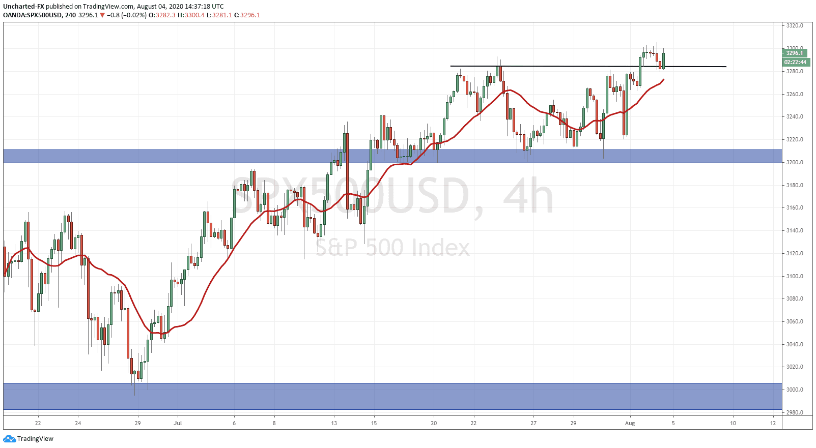
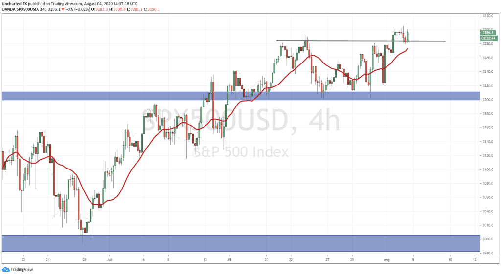
I want to entertain the idea of a potential stock market crash in the month of August. Even though I remain bullish for markets in the long term, this crash could just turn out to be a pullback in the overall trend. Funnily enough, a Marketwatch story out today by the person who called the March market lows is calling for a 10% move lower in markets before a continued run higher. I bring this up because there are 4 charts which I watch to track money flows and stock markets, that are ALL at major support/resistance levels. We can use them to even chart our way to a move higher. If these 4 charts move the opposite direction, then there is a bullish case in stocks. At time of writing, the S&P did break out of our range yesterday and we have now retraced back to this zone, and are now testing it as support. So far the buyers are stepping in.
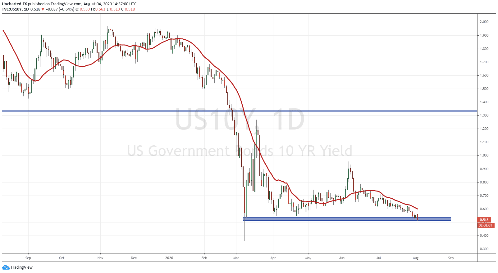
The first chart I want to bring up is of course my preferred method to track risk off and risk on money flows: the 10 year yield. As you can see we are at a major support…and at time of writing it is not looking too good. If we close below this support zone, it would be a historic close. Remember, when yield moves down like this, it means that money is moving into the safety of bonds. This indicates a risk off environment where money leaves stocks for bonds. Keep your eyes on this for this month. If we move up, or remain stable and even just range, that would be stock market positive.
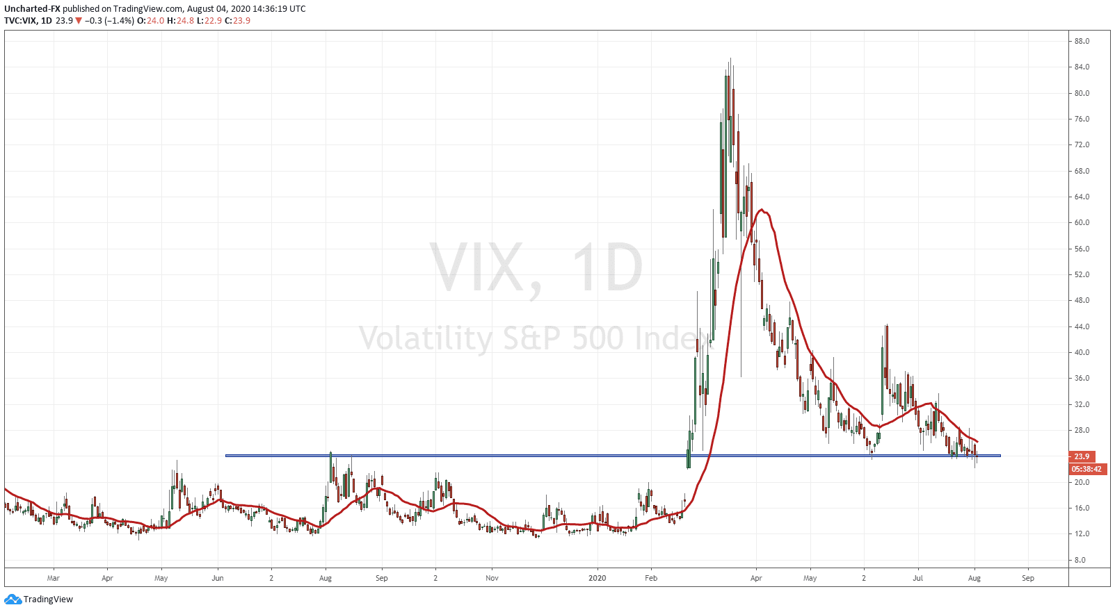
The next chart is the Volatility Index or the VIX. We are at a major flip zone around the 23.5 zone. We have been testing and holding this zone for weeks. If you go down to the 4 hour chart, you can see signs of perhaps a bottoming pattern. This has my attention because if the VIX moves higher, it means fear is coming back into the markets. The bullish case for markets though would be a break and close BELOW this support level which would allow us to drift further lower. A quick note on the VIX: Wall Street actually makes more money when volatility is LOW. If you look at the periods of the VIX whenever it is ranging, that is when the most money is being made. The top trade on wall street has always been to go short the VIX and then long the markets.
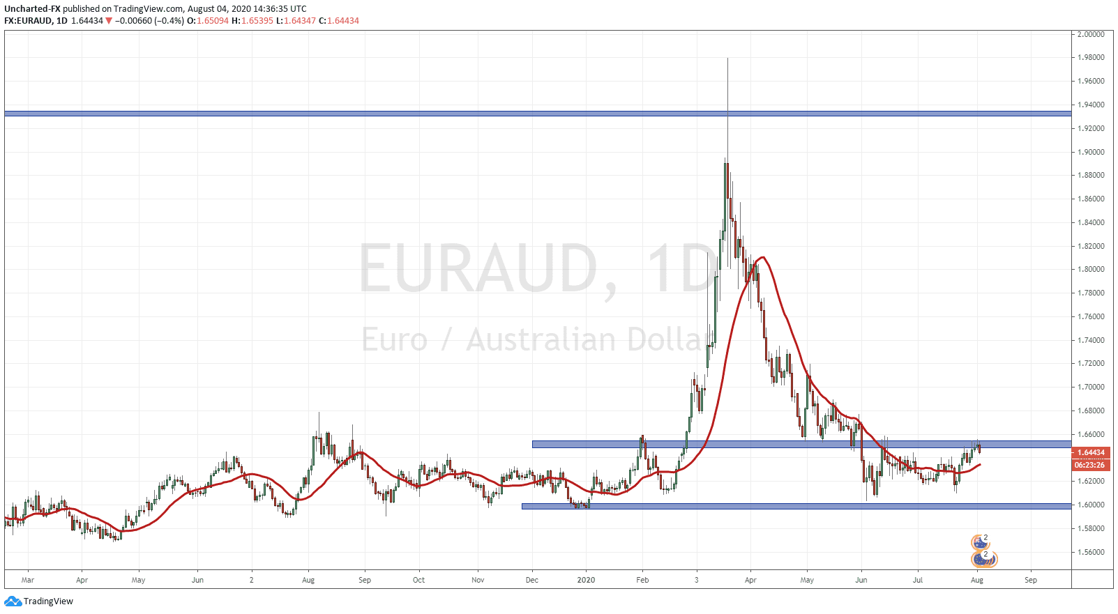
I want to hit the Forex side and talk about the EURAUD. I spoke about this chart being the Forex pair to watch to determine equity moves. It has one of the highest negative correlations with equity markets. Nobody knows why but it works. We have had a lot of success watching the EURAUD on intraday charts to forecast market movements for the day. But of course, this can also be applied to the long term charts. EURAUD seems like it wants to break out above 1.6530. It is a chart that I love to trade and would go long if we get the break and close above this resistance level. Due to the negative correlation, this breakout would be stock market negative. Due to the room above for EURAUD to move, it means the stock markets can fall further down. The opposite scenario is EURAUD rejects this resistance zone and we sell off and move lower, perhaps even range. This would be stock market positive.
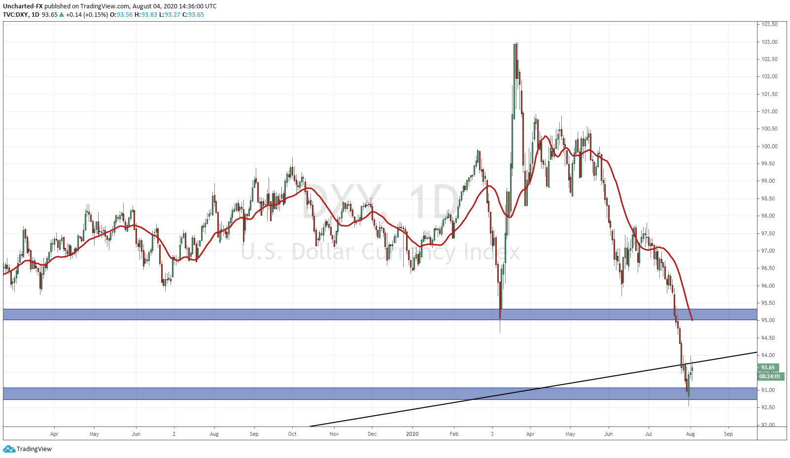
Finally we need to talk about the US Dollar. The Dollar has been smashed recently, and seems overdue for a pullback. The connection between currencies and markets have historically been regarding trade. With a weaker currency, it means domestic companies will have more export sales which means more profits which translates to higher markets based on more earnings. However, in this current environment, trade has taken a hit…and this is where inflation and the classical economist view point comes in. Inflation means a devalued and a weaker currency. This creates a wealth effect as prices rise because it now takes more weaker currency to buy something. This applies to assets such as real estate and stocks as well. So a weaker Dollar is US stock market positive.
There is another way to look at the Dollar, and it has to do with its reserve currency status. Due to this status, the Dollar is seen as a safe haven currency. Hence, when the Dollar is moving lower, there is not much fear meaning we are in a risk on environment (buying stocks) as opposed to a risk off (buying bonds) environment.
Look at the Dollar chart, we are at a major support level at 93.00. From here, it is possible for us to see a bounce higher. Ignore the trendline that I have drawn now…even though we can see price rejecting it on the daily chart. This trendline is a long term weekly trend I drew on the weekly chart indicating a possible breakdown in the Dollar and a new bear trend. However, this week’s candle close will be important in determining the future move in the Dollar.
If you move down to the 4 hour chart, you can see a clear inverse head and shoulders pattern forming. I have outlined this for our Discord channel members and a few Forex pairs I am watching for a Dollar move higher.
If the Dollar does move higher, it could come from domestic US data surprising rather than fear which would not impact the markets as much. We do have US NFP employment numbers on Friday so expect volatility in the Dollar this week.
In summary, these are 4 charts that you should keep tabs on for this week and for the rest of the month. We have seen instances where we get mixed signals…everything pointing to a stock market sell off but markets continue higher instead. It leads us to think perhaps the Fed and the major banks are buying to keep markets propped, and that has a whole set of ugly ramifications if it is true. Regardless, this is how you can use technicals to predict future moves in equities…but more importantly perhaps a future event. When all of these charts are at major support/resistance levels and are poised for breakouts or breakdowns, it can point to something coming down the pipeline.
Trade ideas and market discussion can be found on our Public Discord Channel: https://discord.gg/akcgCVP
Check out and subscribe to our Youtube channel where charts and market events are discussed on our Morning Market Moment show: https://www.youtube.com/channel/UCG7ZYDUeNANJiDxH88F9aQA