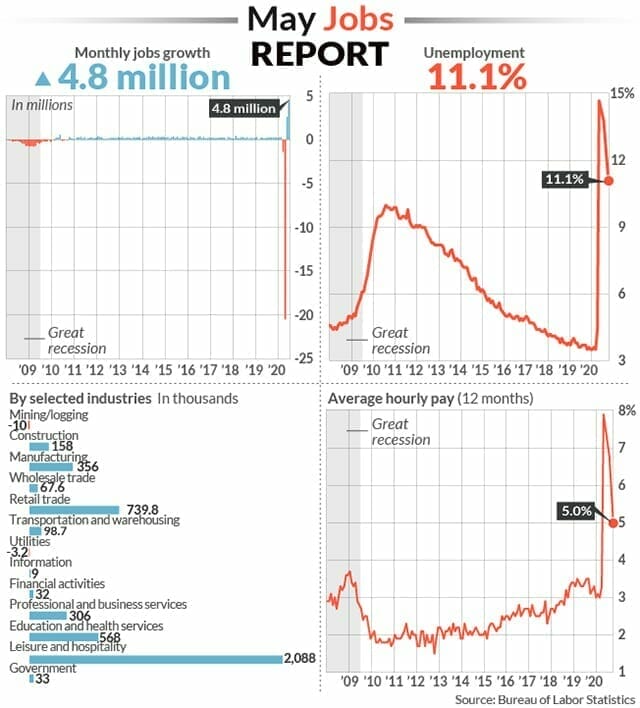
Well, I spoke about the chance of another surprise US Non-Farm Payrolls (NFP) data just like we got last month. It happened. For those not familiar with NFP, it is US employment data which is released on Friday in the first week of every month and is data for the previous month. Jobs data came out today (Thursday) because US markets will be closed tomorrow for Independence Day which falls on a Saturday. The US added a better than expected 4.8 million jobs in the month of June, with the unemployment rate dropping to 11.1%.

Chart data from Marketwatch.
This is strengthening the reopening euphoria case which we spoke about a few weeks ago, and how we thought the Russell 2000 would be the one to gain a boost from this. As you can see from the data, most of the jobs coming back are from leisure and hospitality and retail…most of which were shut down to flatten the curve.
Meanwhile, US weekly Jobless claims for the seven days ended June 27th came out at 1.43 million. Jobless claims were at 1.57 million at the beginning of the month, and was over 3 million per week in May, so we are seeing a downwards trajectory. The problem? Continuing claims. “The number of people receiving traditional jobless benefits rose 59,000 in the week ended June 20 to 19.29 million. These are known as continuing claims. This is the first increase after three straight weekly declines, and could be a sign that progress in the labor market is stalling.”
Many traders and experts are saying that this is the Jobs data that people should be talking about, not the NFP data. Even though economists have come out doubting the US NFP data last month, and will likely debate today’s data, the markets love it.
The Nasdaq makes record high after record high. This can be due to the retail crowd playing tech stocks. A lot of articles out on financial media about the rise of Robinhood traders. How a lot of Americans are using their stimulus money to day trade stocks trying to create a source of income in a time they are unemployed. This has been the cause of overvalued tech stocks and erratic price action in the Nasdaq which worries some hedge funds and economists.
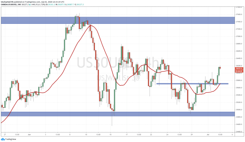
The chart that I posted this week over on Discord for an entry trigger was the Dow Jones. First of all, on Monday’s Market Moment blog post, I discussed the 3 risks weighing in on markets (still can be stirred up) in this battle between fear and greed. If you look back at the charts I posted, particularly the daily charts of the US Indices, those trendlines and support zones have held. As long as we remain above those zones, we are technically still in an uptrend. I really liked the Dow chart because it gave us a pattern.
We had both the daily chart and the 4 hour charts giving us bullish signals. The daily held the support and trendline, and on the 4 hour chart, we got a nice market structure pattern. A head and shoulders pattern. Once again, what this pattern indicates is a trend shift. Once the neckline is broken, we have gone from making lower highs into higher lows. The main component of an uptrend.
By looking at the charts, you can see we first had the nice break above the neckline, and then price retraced to retest the neckline. Pay attention to the large wick we got during the pullback and retest. It shook out a lot of traders. You hear me say this all the time, but this is why patience and waiting for the candle closes is powerful! To the day trader, it looked like this breakout was going to be a fake out. That candle was once all red. But then price reversed from the lows and closed near the highs of that 4 hour candle. A strong recovery. This move likely shook more day traders and frustrated them indeed. We have been seeing this more often and I attribute this to the market makers and more experienced traders. They know a lot of new retail traders have entered the markets and are creating these traps to flush them out. This is why I am a strong advocate of swing trading and looking at longer term charts. I began as a day trader, but after working with institutions and prop funds, it is really the long term charts where the real money is made. The big boys are looking at those charts, and I believe you should be too.
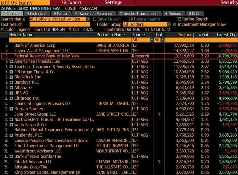
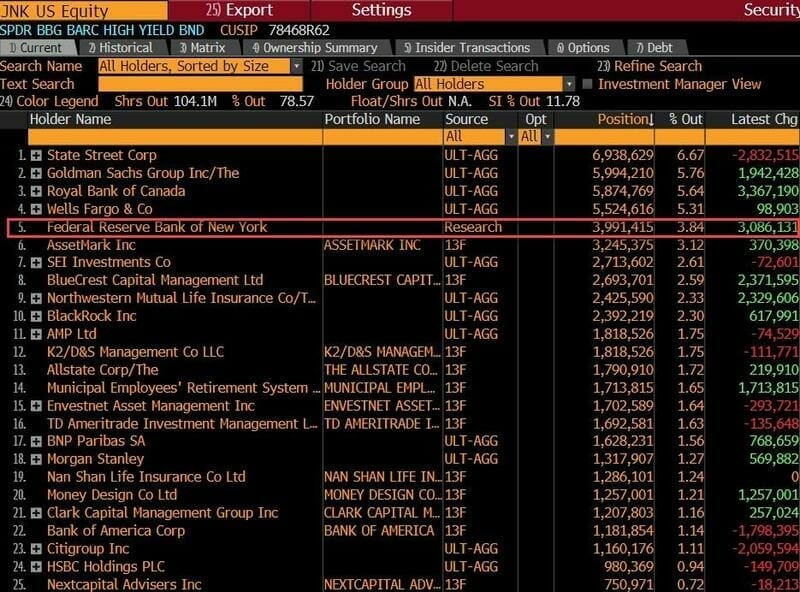
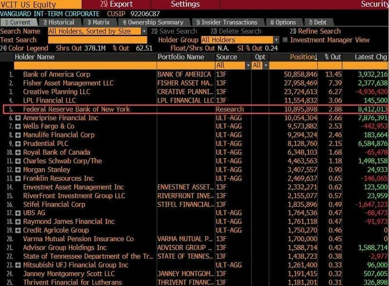
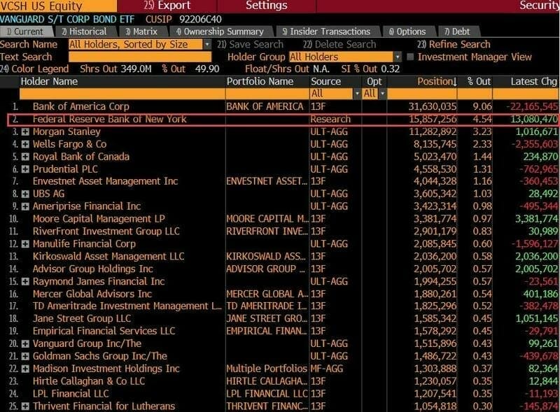
I want to end this with a crazy article. We know the Fed has been expanding their balance sheet. They are buying municipal bonds, corporate bond ETFs, individual corporate bonds and mortgage backed securities. Here on this blog, I have been saying the Fed will become the buyers of last resort and will buy up everything. Expect them to announce that they will dip their toes into the stock markets if they have to in order to keep them propped. Well this article came out on Zerohedge showing the Fed is a top 5 holder of the largest corporate bond ETFs. Let me leave you with these Bloomberg terminal screenshots on corporate bond ETFS LQD, JNK, VCIT, and VCSH and you can ponder what it means. Do not bet against the Fed.