
My readers and my followers know about the first chart I look at every morning to predict stock market movements. The bond markets. Specifically, the 10 year yield ( TNX ). Remember, bond price and yields are negatively correlated: when bond prices move up, the yields drop lower and vice versa. A lot of the money managing community relies on the asset allocation model. Where you shift from one asset to another in order to rebalance the portfolio. When stocks are expensive, you sell and buy bonds. When bonds are too expensive, you sell and buy stocks. However, with the current market environment, the CFA’s and infamous value investors (Buffett) are having a hard time evaluating these assets. I have been arguing that all that stuff is out the window now. This is a central banks driven market. Central banks have created an environment to keep assets propped. Whether they fail or succeed will remain to be seen. During the 2008 Great Financial Crisis ( GFC ) the terms risk off and risk on were used to determine money flows. A risk off environment was one where money left stocks and into safety assets, particularly bonds. While a risk on environment was one where money left safety assets and ran to stocks. It was guided by fear, an emotion we are too familiar with in this market condition. It really has been fear which has kept markets subdued the past week on stories of Covid second waves, China and India, China and the US, riots and protests etc. The 10 year yield can be used to determine the fear gauge similar to the Volatility Index commonly known as the VIX . But what about the Forex market? Many do not understand the scope of trading and volume in the Forex (currency) markets. Yes, the bond/ debt markets are the largest in the world, but in volume per day statistics, the Forex market is on its own. An estimated $6.6 TRILLION in trading occurs per day on the Forex markets, a number that has greatly increased when I began trading Forex about six years ago (was just over $3 Trillion).
The real action occurs on the Forex markets, and for someone who is keen on geopolitics and the macro environment, the Forex market is the place to be. While stocks are taking the headlines currently, in the future, we will see the largest moves in the Forex market given all the craziness in the world.
So how can we use the Forex markets to gauge money flows particularly into stocks? Well the obvious currencies have always been the safe haven currencies: the US Dollar , the Japanese Yen , the Swiss Franc (although I would not say as much as the other two mentioned), and I would personally throw in Gold . Even though many consider Gold as a commodity, in the classical economics thought, Gold is considered a currency and when you see Gold break out into new all time highs against other Fiat, just like we have seen with pretty much every currency besides the US Dollar , it gives us a sign that the currency will be getting devalued/inflated.
In a previous post I spoke about the Dollar and the Yen trades. The Dollar is the world reserve currency and some say the best out of the fiat currencies. The Dollar being the reserve currency allows the US to print as much as they want without needing to worry about the debt. This is due to the reserve currency status as it gives the US artificial demand for the Dollar always. Something the French called Exorbitant Privilege. The US can print as much Dollars as they want and the only way they would see hyperinflation is if we see a fall in US Dollar DEMAND. Hence why the Fed pretty much helped bail out nations recently by opening US Dollar swap lines with them so they could use the Dollars for fiscal and monetary reasons rather than printing their own fiat currency which would lead to hyperinflation.
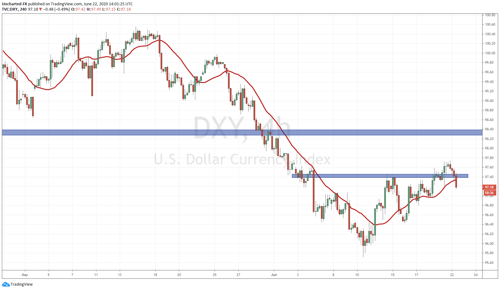
As mentioned previously, I have written about this pattern on the US Dollar Index ( DXY ). It is showing a reversal pattern which is called the head and shoulders pattern. We have had a multiple downtrend with many lower highs and lower lows, and we began to exhaust, creating no more new lower lows, which indicated the trend was about to reverse. The number one lesson to remember about markets and market structure is that they do NOT move in straight lines nor do they move in one direction forever. They move creating swings, almost like waves hitting the beach and then receding before repeating. My job is to find these waves and predict when the tide is about to turn.
The DXY had a nice break above the head and shoulders neckline, and from here, we want to see whether Dollar strength will continue. We have seen buyers step in as resistance now turned support with a large wick indicating a floor. On the daily chart I must stress there is a large resistance zone at the 98.40 zone. That would be a good target if the neckline here holds. Again, a move into the Dollar could be suggesting some fear and money perhaps running into the Dollar for safety. At time of writing, and as you can see from the chart, there is a chance the next 4 hour close will be BELOW the neckline which would nullify this pattern. Perhaps indicating a move higher in equities which are currently being bid up.
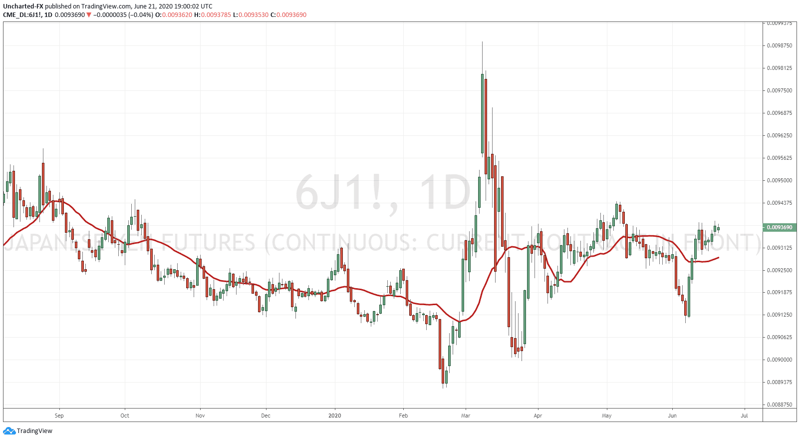
Believe it or not, but the Japanese Yen is actually seen as the dominant safe haven currency. A lot of fund managers say they would rather hold Yen than Dollars for a rainy day. With all the Bank of Japan has done with negative rates and QE infinity, many still wonder why the Yen remains quite strong. This has to do with balance of payments. With the Yen being weaker when those policies were instigated, it increased purchases of Japanese Yen exports. More nations demanded Japanese Yen in order to buy Japanese products. This increased the Demand for the Yen, and because Japan became a creditor nation with a large current account surplus, it creates upward pressure for the currency.
Japan has historically been seen as a safe haven due to two things. First of all, the government is pretty stable which means the nation is relatively stable. Secondly, Japanese citizens are the highest savers among Western allied nations. This means that the debt is backed by savers…something you cannot say for the US nor many western nations.
For Forex traders, the Yen pairs are our go to for risk and fear in markets, a well as major sell offs in equities. The Yen pairs have a high positive correlation with stocks meaning when stocks move down, the Yen pairs do as well. Indicating a move into safety. If you look at individual Yen pairs during recent price action, you can see the large falls and then the large rises in them which perfectly mimic the stock markets. Currently, the Yen Futures chart does not look like a set up I would trade, but there is a chance it may break and close above this resistance it is currently testing. This could be indicating a move lower in stocks.
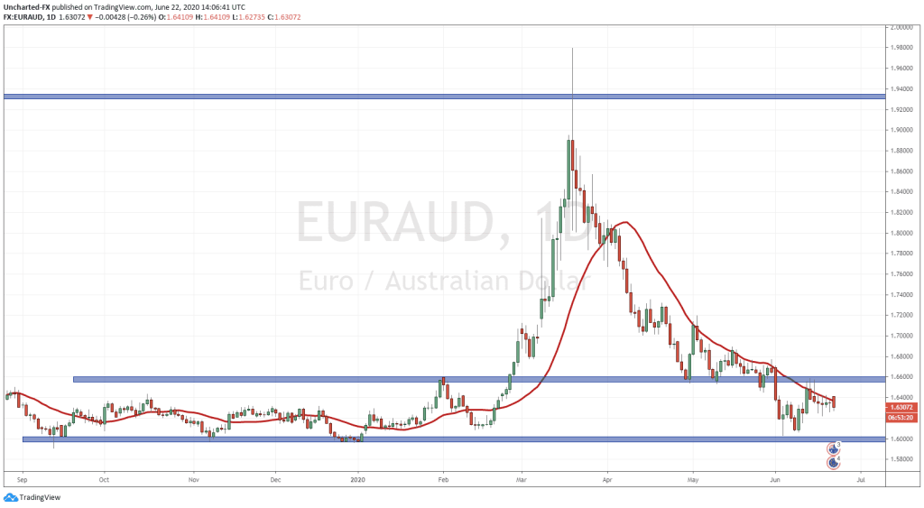
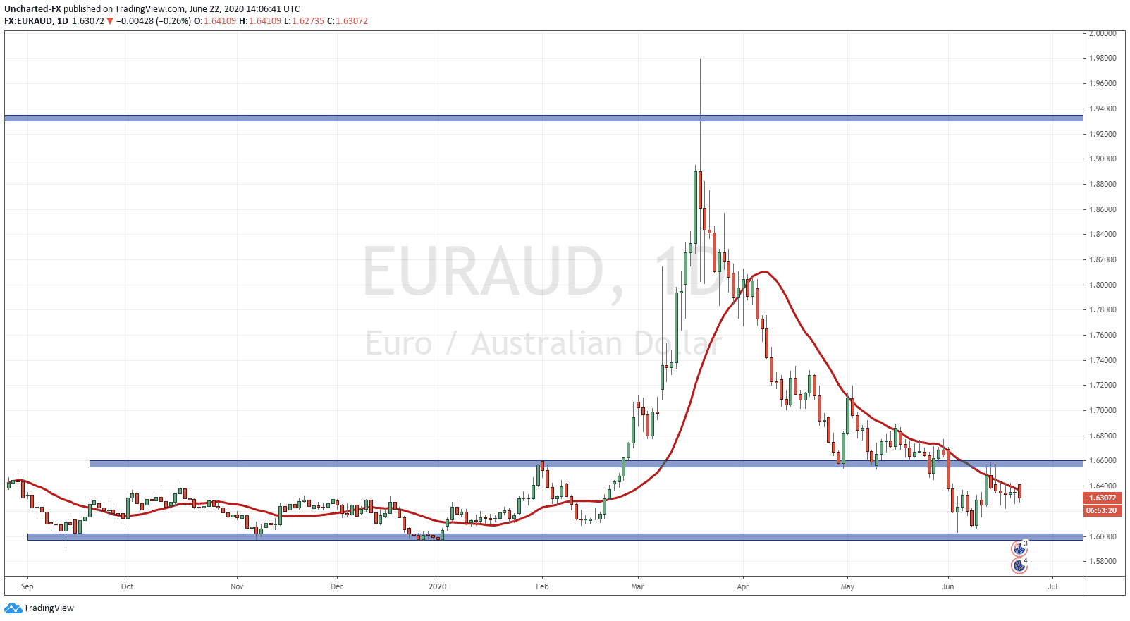
Now that we covered the 3 ways to predict stock market moves: 10 year yield, the DXY and the Yen, I want to talk about the one Forex pair which has the highest negative correlation to stocks. Nobody really knows why, but the price action is telling. I am talking about the EURAUD .
Yes! Believe it or not but the EURAUD is a great way to predict stock market movements on the long term charts AND the intraday short term charts. Price action is indicating a possible stock market fall.
Just looking at EURAUD , we have had a very extended downtrend. Many lower highs and lower lows all the way from the 1.94 zone. There was a big support/flip zone at 1.66 (flip zone just a term for a zone which has BOTH been support and resistance in the past) where we were expecting a bounce or a reversal from. We cut through it. And then hit another major support zone at the 1.60 level. So far we have bounced form it but do remain below 1.66.
This pattern excites me because we could be seeing a reversal here. Either we move up and break above 1.66, creating a cup and handle reversal pattern, OR we may break down and retest 1.60 and could possibly create a double bottom reversal pattern. The other case is a break down of 1.60 and a continuation of the downtrend lower.
So what does this mean for stock markets? Well since this has a high negative correlation (about 93%). When EURAUD is moving higher, stock markets are moving lower, and when stock markets are moving higher, EURAUD is moving lower. What I have outlined has indicated a higher chance of this pair reversing indicating stock markets falling. The only bullish case for stock markets will be if EURAUD breaks below 1.60.
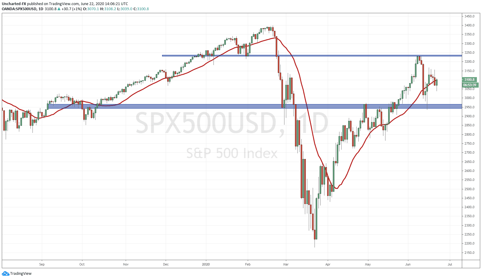
Just for comparison, look at the daily charts of both EURAUD and the SPX500 together.
So now you will have another tool to use to track money flows. The bond market, the US Dollar and the Japanese Yen are quite common and you hear the mainstream financial media talking about when they try to look for fear sentiment in the markets. EURAUD may be a secret tool, but not anymore. It has been very reliable calling moves recently and it is something you should add to your tool box.
For up to date coverage on markets and these levels, join us over on the Equity Guru Discord Channel. EURAUD is used extensively by us as well as looking at the Ten Year Yield.
Trade ideas and market discussion can be found on our Public Discord Channel: https://discord.gg/akcgCVP
Check out and subscribe to our Youtube channel where charts and market events are discussed on our Morning Market Moment show: https://www.youtube.com/channel/UCG7ZYDUeNANJiDxH88F9aQA